# Colors
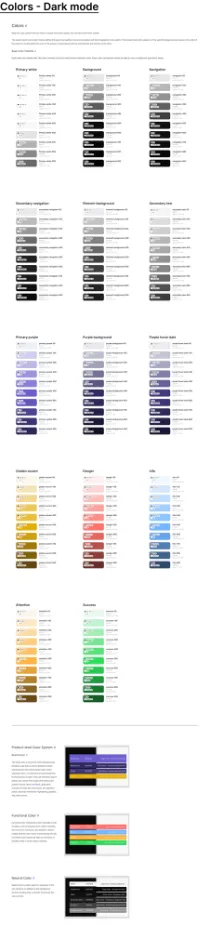
Dippi has color system into two levels: a system-level color system and a product-level color system.
The system-level color system mainly defines the basic color palette, neutral color palette and data visualization color palette. The product-level color system is in the specific design process, based on the color of the system to further define the tone of the product in accordance with the requirements and function of the color.
Base Color Palettes
Dippi's base color palette totals 140 colors, including 14 primary colors and their derivative colors. These colors can basically include the need for color in background applications design.
Primary color - Purple
colors.purple
90080070060050040030020010050
Accent color
colors.yellow
90080070060050040030020010050
Success
colors.green
90080070060050040030020010050
Info
colors.blue
900800700600500400300200100050
Danger
colors.red
900800700600500400300200100050
Attention
colors.yellow
90080070060050040030020010050
Primary neutral color - White
colors.orange
90080070060050040030020010050
Primary neutral color - Black
colors.green
90080070060050040030020010050
# Font Principles
The font system is one of the most foundational parts of any interface design.
Text is a major channel for users to understand application content and complete their work, and a well designed font system will greatly enhance the user's reading experience and work efficiency.
Base Font Size
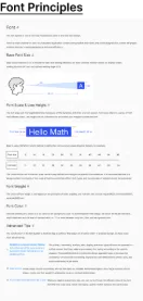
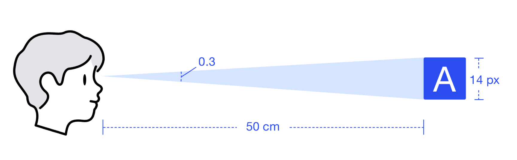
Dippi's base font size is 14 to ensure the best user reading efficiency on most common monitors based on display screen reading distance (50 cm) and optimal reading angle (0.3).
Font Scale & Line Height
The font scale and line height determine the beauty of the dynamics and order of a font system. Font scale refers to a series of font with different sizes. Line height can be understood as an invisible box wrapped outside the font.
Dippi is using 140% font height method to define font sizes and corresponding line heights, for example:
Font size1214162024323640486496...
Line height17202228344550566790134...
# Typography
Basic text writing, including headings, body text, lists, and more.
Type System
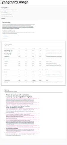
| Component and layout headings | Family | Size | Line Height | Weight | Usage |
|---|
| heading-01 | Figtree | 40px | 140% | Regular | Content headings, marketing page headings, large display headings |
| heading-02 | Figtree | 32px | 140% | Regular | Content headings, marketing page headings, large display headings |
| heading-03 | Figtree | 24px | 140% | Regular | Content headings, marketing page headings, large display headings |
| heading-04 | Figtree | 20px | 140% | Regular | Content headings, marketing page headings, large display headings |
| heading-05 | Figtree | 16px | 140% | Regular | Standard cards, panels |
| heading-06 | Figtree | 14px | 140% | Regular | Standard cards/panels, list items, menu items |
| heading-07 | Figtree | 12px | 140% | Regular | Standard cards, panels, compact list items, compact menu items |
| Body/base Styles | Family | Size | Line Height | Weight | Usage |
|---|
| body-01 | Ubuntu | 16px | 140% | Regular | Body copy for touch devices and more spacious Marketing pages |
| body-02 | Ubuntu | 14px | 140% | Regular | Standard Body style for web and general product pages |
| body-03 | Ubuntu | 12px | 140% | Regular | Standard Body style for Desktop and more condensed product designs. |
| Supporting Styles | Family | Size | Line Height | Weight | Usage |
|---|
| MONO TYPE | Sono | Variable | 140% | Regular | Displaying names and numbers in mono typeface |